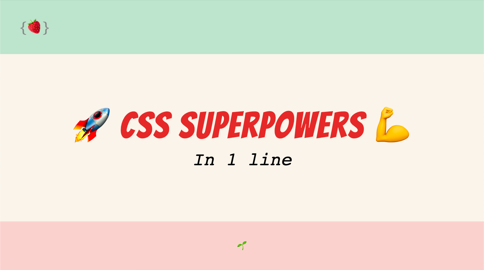
I recently came across an extremely useful video about CSS tips and tricks made by Una Kravets on the Google Chrome Developers Youtube channel: 10 modern layouts in 1 line of CSS. I think the title speaks by itself. Let’s see how to create 10 single-line layouts!
First and foremost, have a look at the video, it is very detailed and nicely explained ;)
If you want to give it a try, go to the Glitch demo page: 1linelayouts.glitch.me
And if you are lazy, here is a quick recap:
1. Super Centered
How to (finally) center an element both horizontally and vertically.
place-items: center
2. The Deconstructed Pancake
A responsive layout to display elements horizontally on wide screens and stack them up nicely on mobile.
flex: 0 1 <baseWidth>
3. Sidebar Says
A 2-columns template with a column having min and max width depending on your screen width.
grid-template-columns: minmax(<min>, <max>) ...
4. Pancake Stack
A vertical layout with adapting height for header and footer.
grid-template-rows: auto 1fr auto
5. Classic Holy Grail Layout
A full layout, with adpating height for header and footer plus adapting width for left and right sidebars.
grid-template: auto 1fr auto / auto 1fr auto
6. 12-Span Grid
The classic 12 columns template, without Bootstrap ;)
grid-template-columns: repeat(12, 1fr)
7. RAM (Repeat, Auto, Minmax)
A bit similar to #2, but with a different behaviour, especially when using auto-fit or auto-fill.
grid-template-columns: repeat(auto-fit, minmax(<base>, 1fr))
8. Line Up
For me, the most elegant solution to align elements with different content sizes.
justify-content: space-between
9. Clamping My Style
How to replace 3 media queries by 1 line of code to set different behaviours depending on the screen size.
clamp(<min>, <actual>, <max>)
10. Respect for Aspect
No more calculations or set width and auto height to respect the element aspect ratio.
aspect-ratio: <width> / <height>
I hope you found it useful, feel free to buy me a coffee (or tea) to support the blog :)